.jpg)
Introduction
Invictus Performance Lab operates at the intersection of sport science, diagnostics, and human performance. In a landscape increasingly shaped by lifestyle wellness brands and aesthetic-led fitness spaces, Invictus set out to occupy a far more disciplined position rooted in measurement, methodology, and repeatable outcomes.
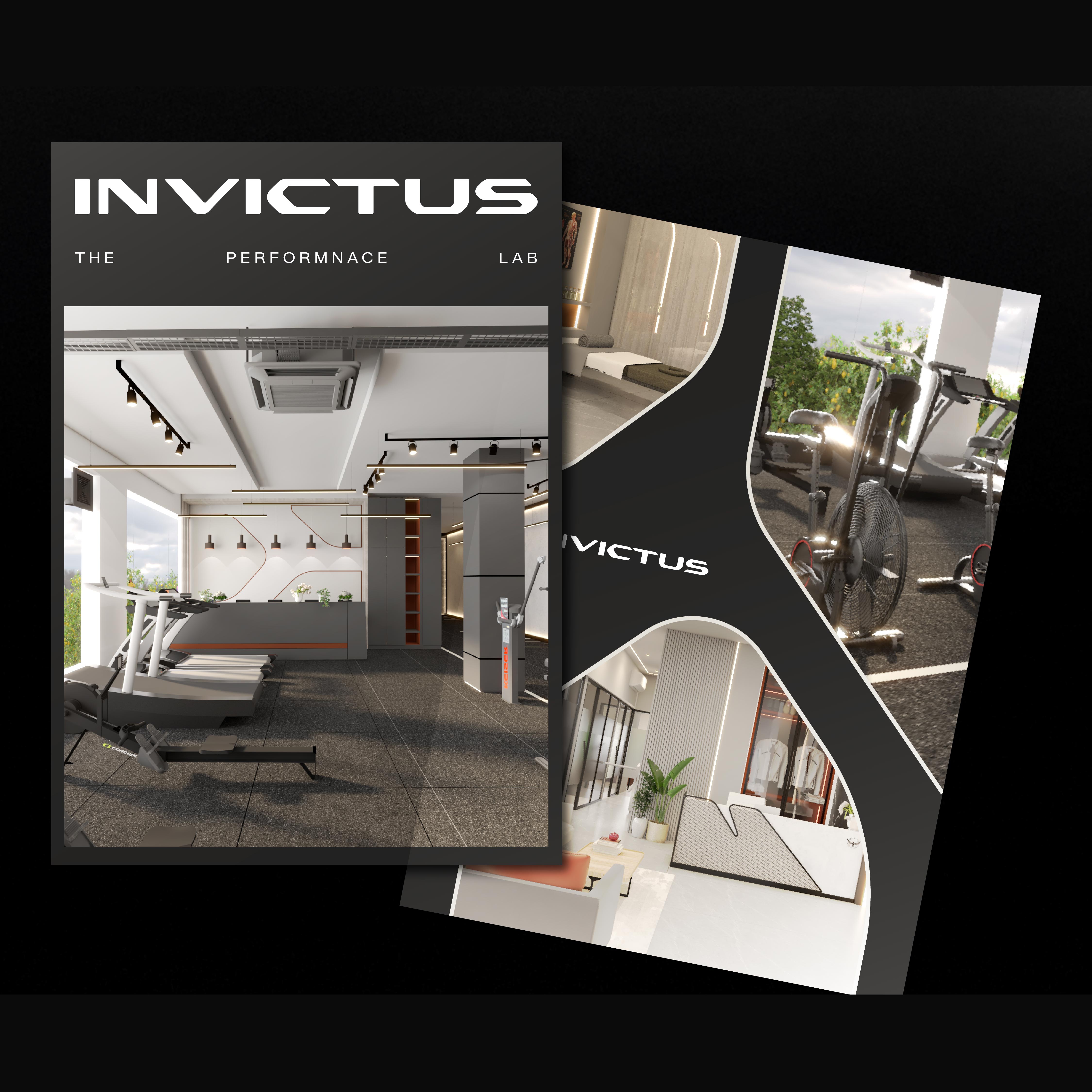
We were engaged to lead a complete rebrand across both visual identity and physical environments. The objective was not to modernise a gym brand, but to architect a performance institution that reflects how elite training, diagnostics, and data-led health ecosystems are evolving globally.
The ambition was to move away from the language of motivation and surface-level fitness, and toward credibility, structure, and authority. Every design decision needed to communicate intent, control, and intelligence, where performance is engineered through systems rather than promised through rhetoric.
Brand Identity System
Logo Design
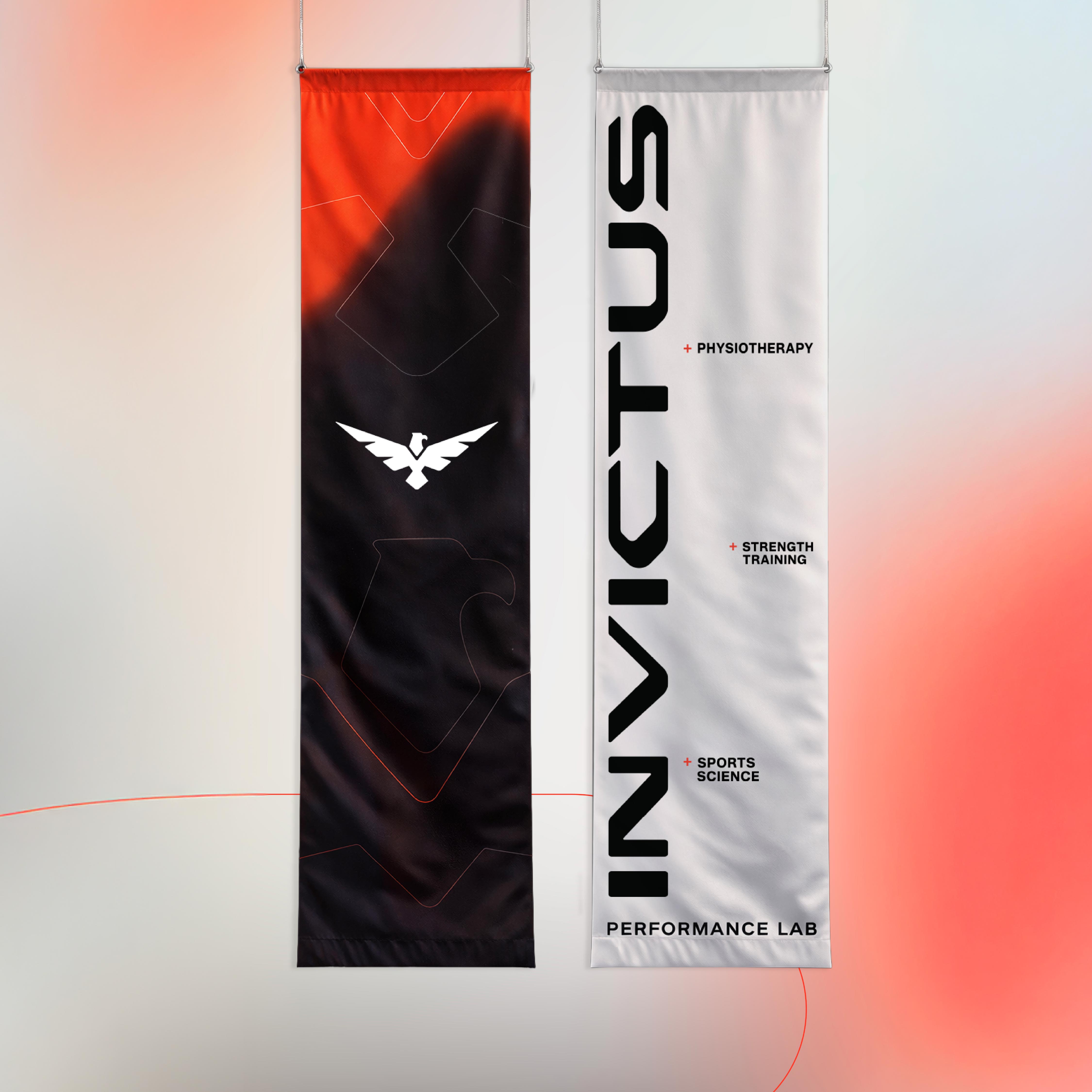
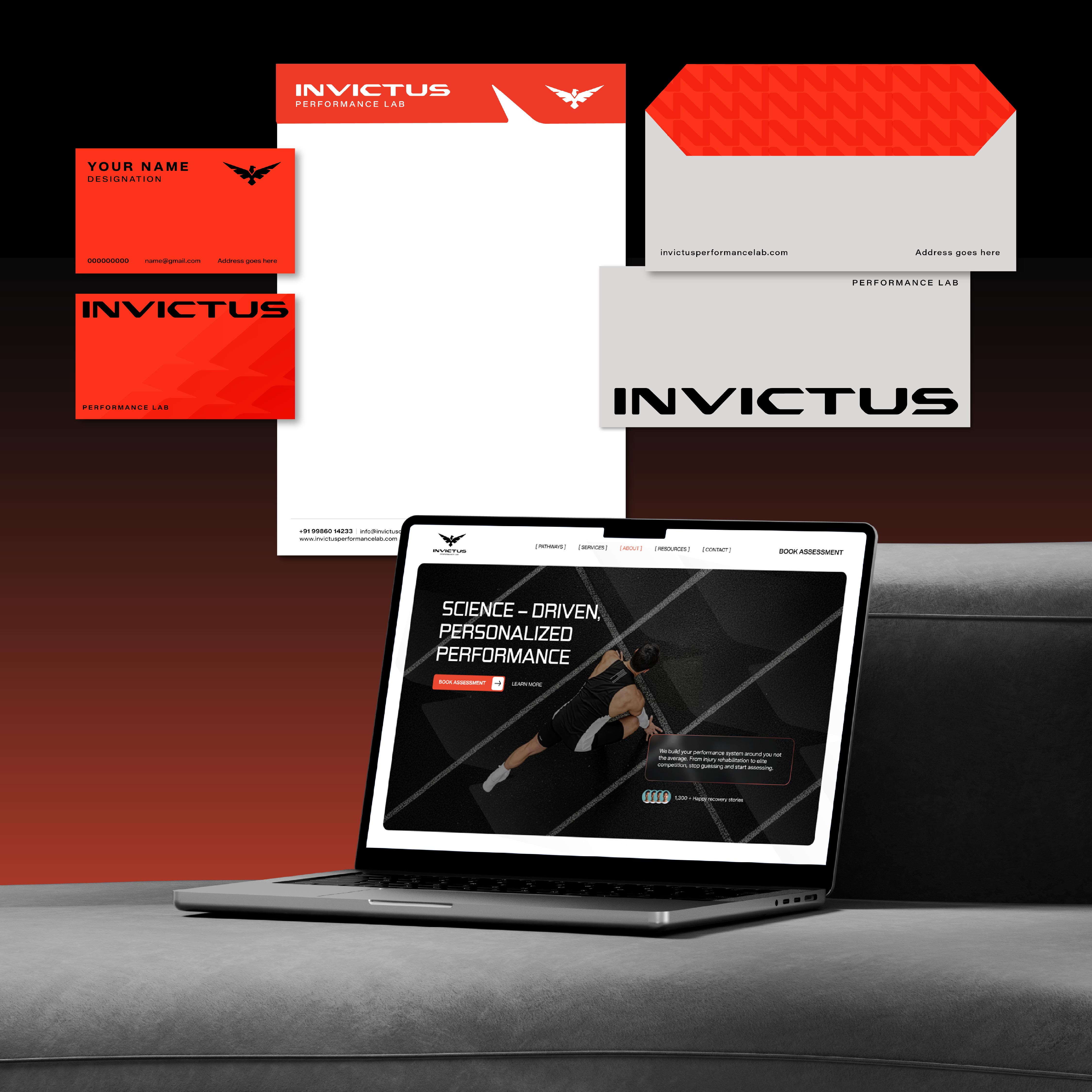
The Invictus logo was designed to convey discipline, control, and institutional confidence. Built using precise geometry and deliberate proportions, the mark reflects a systems-driven approach to human performance.
Its restrained form allows it to function seamlessly across complex contexts, including digital dashboards, large-scale spatial applications, performance reports, and apparel. Rather than relying on visual aggression, the logo establishes authority through clarity and consistency, positioning Invictus closer to a laboratory or institute than a conventional fitness brand.
Colour Palette
The colour system is minimal and measured, designed to convey calm confidence and credibility. A controlled primary palette establishes institutional presence, while secondary colours are used selectively to support navigation, data hierarchy, and information clarity.
Nothing within the palette is decorative. Each colour exists to serve function, legibility, and performance-led communication.
Typography
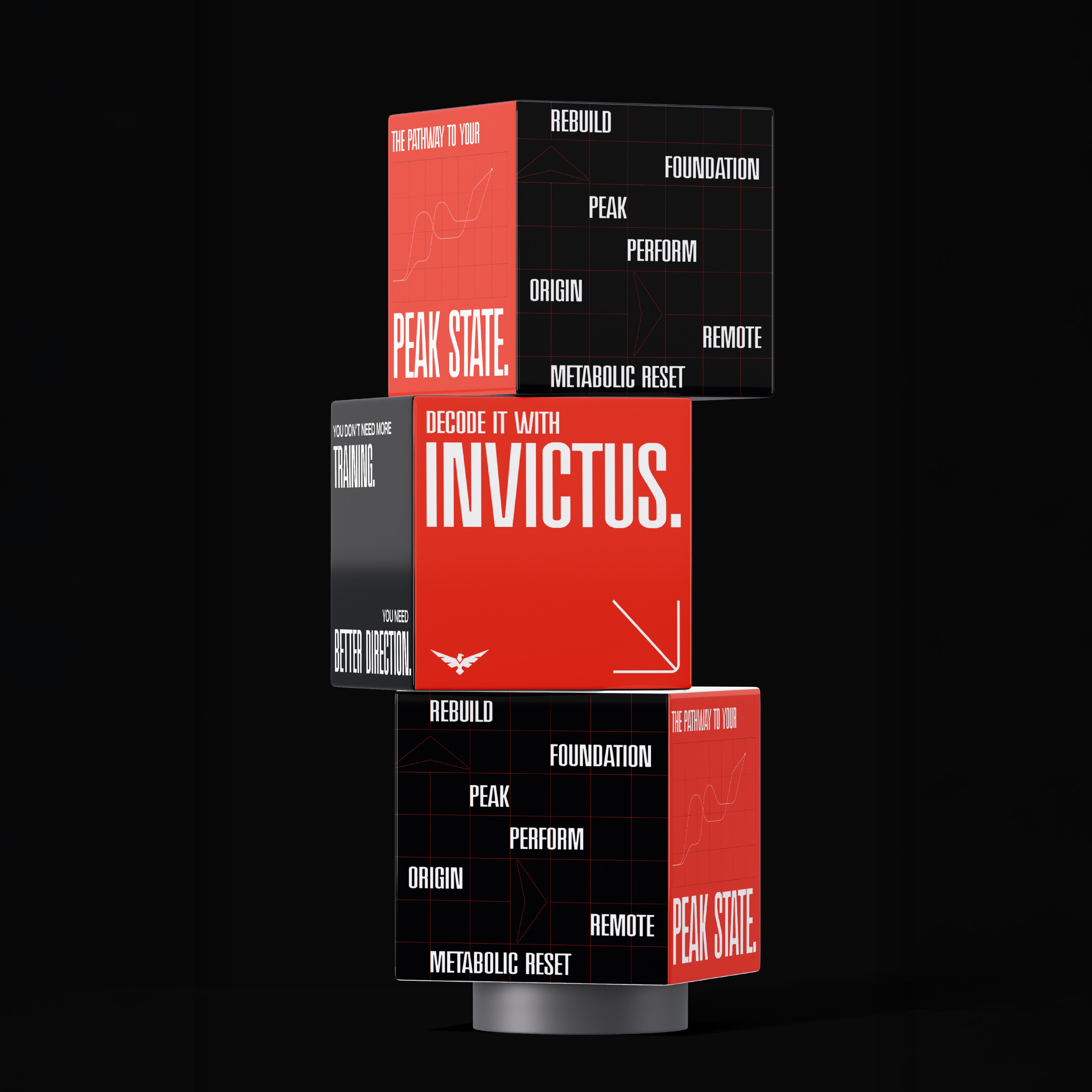
Typography was selected to reflect structure, intelligence, and precision. Clean, modern typefaces ensure high legibility across both digital interfaces and physical environments.
The typographic system supports content-heavy applications such as metrics, reports, and signage, reinforcing Invictus’ data-first tone while maintaining visual discipline across touchpoint.
.gif)
.gif)

.jpg)