Scope Of Work
Bengaluru Cafe has long been a neighborhood favorite, known for its authentic South Indian vegetarian cuisine and signature filter coffee. As it expands to a much larger space, the brand needed an identity that reflected this evolution while staying true to its roots. The rebranding balances heritage and modernity, ensuring that both loyal patrons and new visitors feel at home.
Logo & Visual Identity
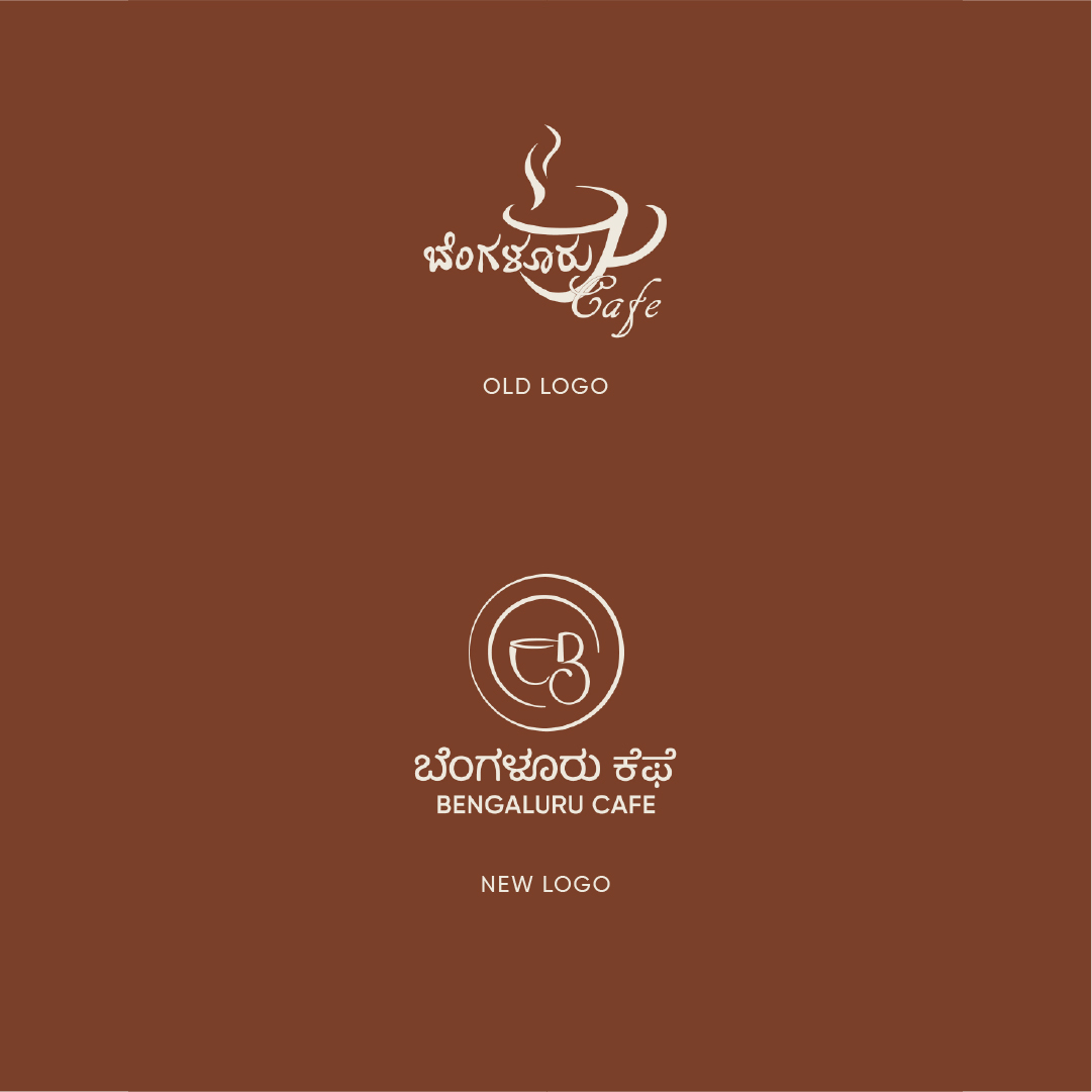
While we explored entirely new logo concepts, it became clear that the existing logo—especially the iconic filter coffee cup—held deep significance for customers. Rather than moving away from it completely, we refined and modernized the mark, preserving its essence while giving it a more structured and polished feel. This approach underscores the importance of maintaining brand familiarity, especially for businesses with strong community ties.
Patterns & Typography
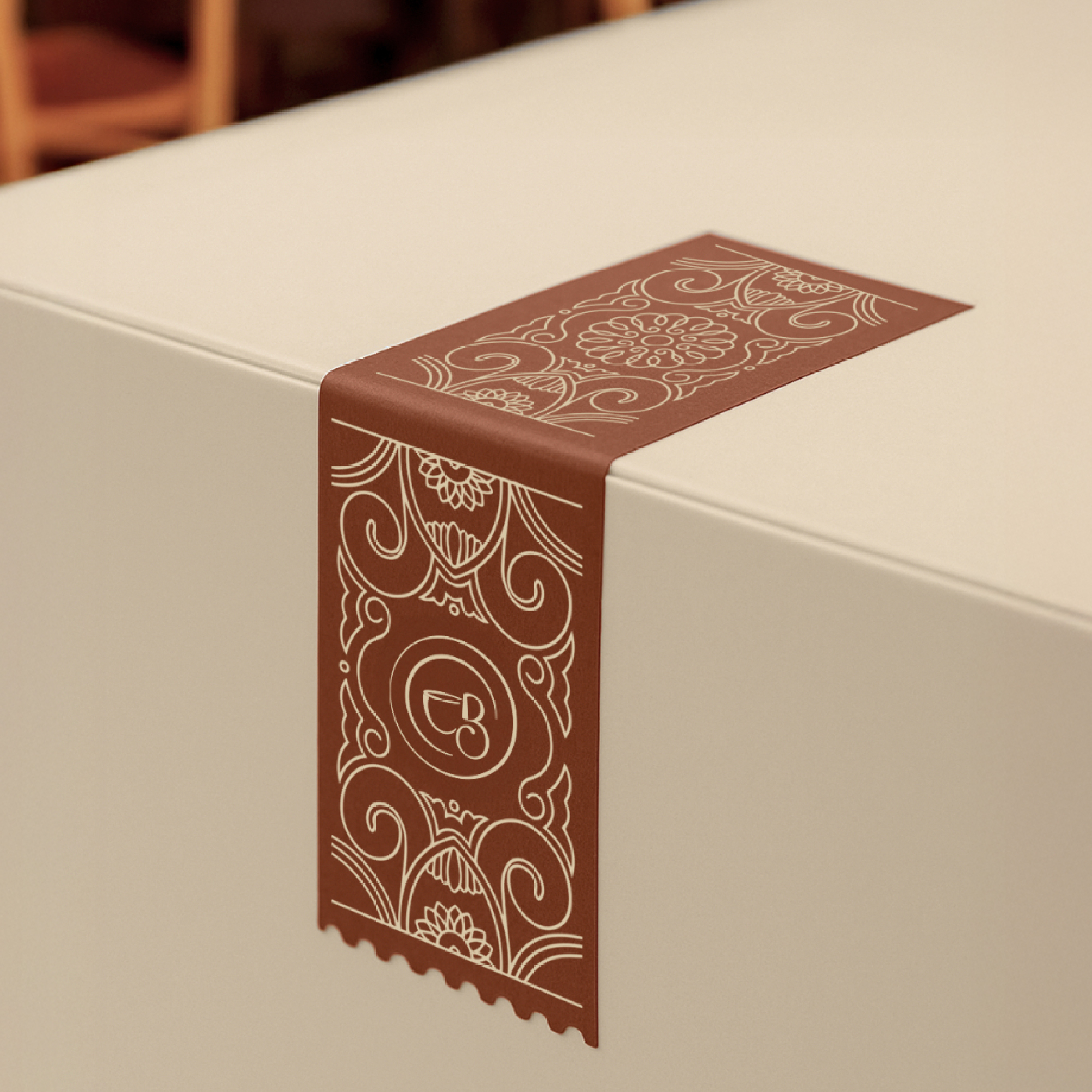
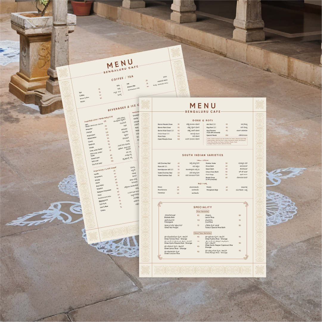
Inspired by the Kannada letter “ಬೆ” from “Bengaluru,” we developed a custom brand pattern that subtly forms a heart shape and floral motif—symbolizing warmth, tradition, and the blossoming nature of South Indian culture. The typography system pairs a modern, clean typeface with Baloo Tamma, a Kannada font that reinforces the brand’s regional identity.

.gif)