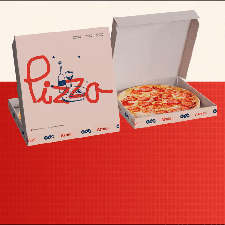
Amicii is a brand shaped by feeling. It transforms the idea of a restro-bar into a space for meaningful presence. Every element is designed to hold emotion with intention. The experience is not about performance, it is about presence.
Naming
The name Amicii is drawn from the Italian word for friends. It speaks to the brand’s foundation in warmth, closeness, and shared memory. The triple i is a deliberate choice. It references the space’s former identity, Three Dots and a Dash, preserving the three dots as part of its visual and conceptual legacy. The name becomes a bridge between where it came from and what it is becoming.
Logo
The logotype is expressive and human. It is accompanied by three distinct dots, each representing one of Amicii’s emotional pillars - Joy, Trust and Love. These elements come together to form a symbol system that is immediately recognisable and emotionally resonant.
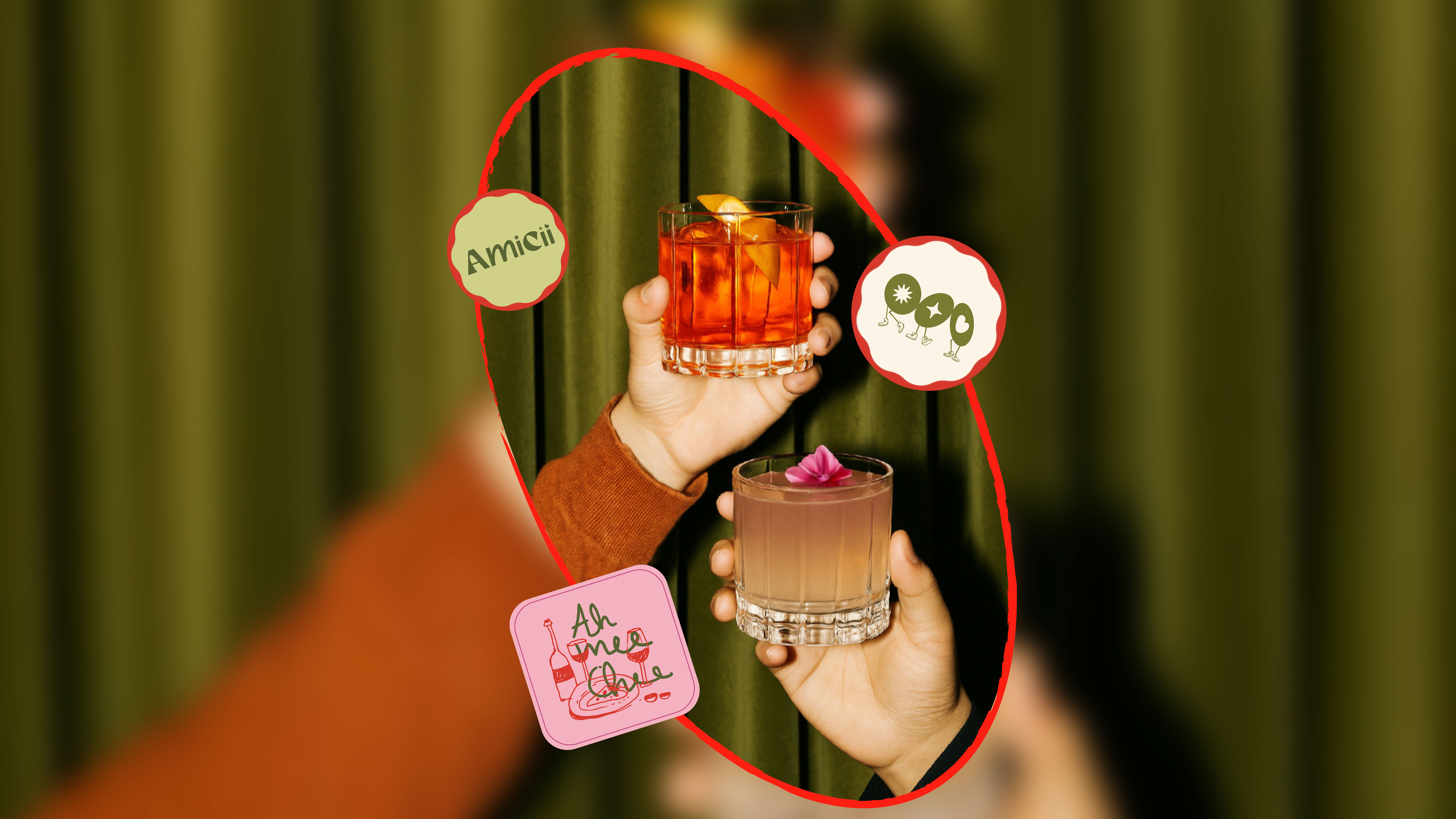
Visual Identity
The visual system is calm and layered. A palette of softened pastels and grounded accents reflects the emotional range of the brand. Typography is led by Helvetica Neue for clarity and discipline. It is supported by Mozie and Georgia which introduce character and intimacy. The combination allows the identity to shift between tonalities while maintaining coherence.


.jpg)