Meldhaus - Bold. Brutalist. Brewed Differently.
Meldhaus

Meldhaus is a bold, expressive brewery brand born as the rebellious sibling of Forge Brewhaus. It embodies the fusion of flavour and form melding creativity with precision through a raw, architectural experience where every beer is a statement and every detail is intentional.
Logo Design
Inspired by brutalist geometry, the logo features sharp, modular forms that echo the brewery’s physical structure. Its commanding presence, whether in full wordmark, favicon, or submark, reinforces the brand’s architectural and expressive spirit
Colour Palette & Typeface
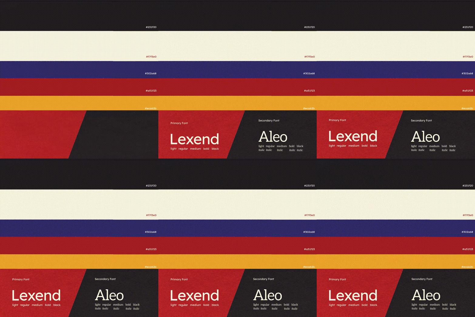
A bold palette of deep navy, bone cream, crimson, asphalt black, and marigold creates striking contrast. The use of Lexend (primary) and Aleo (secondary) typefaces balances contemporary edge with legibility and flair.



Spatial Branding
From the bold industrial façade signage to custom flags in bold brand colours, the identity announces itself before you even step inside. The designs meet textures and oversized letterforms, a fully immersive maximalist brutalist concept brought to life.
Outcome
Meldhaus establishes itself as more than a brewery - it is a destination. With its immersive space, unapologetic branding, and bold beer philosophy, it invites a new generation of drinkers to explore, express, and experience brewing like never before.
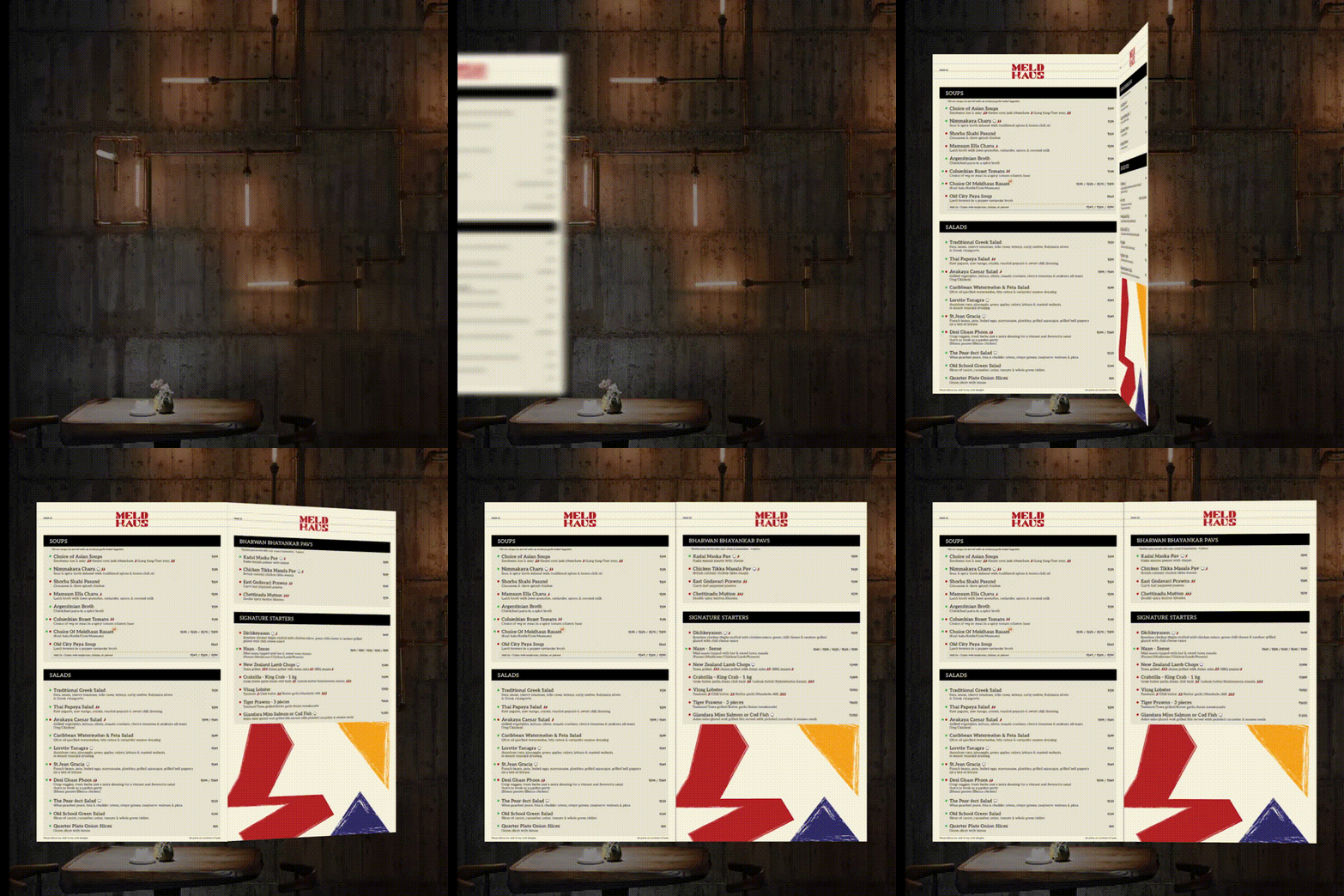
Selected applications of the brand system across touchpoints.


Working on something like this?
Tell us about the brand or business you're building. We reply within 24 hours.
Start a project